

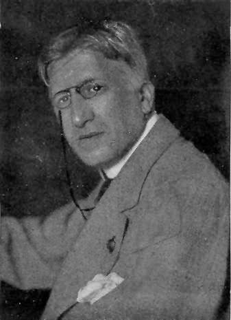
 Edmund J. Sullivan was born in 1869, bracketed in time by Sime, Rackham
and Brangwyn in 1867
and Eric Pape, Charles Robinson and Parrish in 1870. He learned how to draw from
his father, who was an artist.
Edmund J. Sullivan was born in 1869, bracketed in time by Sime, Rackham
and Brangwyn in 1867
and Eric Pape, Charles Robinson and Parrish in 1870. He learned how to draw from
his father, who was an artist.
As mentioned before in several other of these biographies, the last 15 years of the 19th century were an explosive time for print and graphics. New advances in technology had increased the speed and print runs of presses and new reproductive techniques had increased the fidelity of and decreased the pre-press time for illustrations. The publishers in Britain and America, spurred by a seemingly insatiable public demand for them, responded with overwhelming numbers of illustrated magazines. Providing drawings for these new magazines and newspapers suddenly made "illustrator" an occupation and young artists flocked to the job.
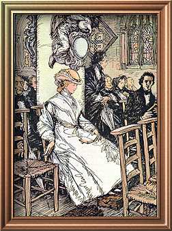
At age 19. Sullivan began his career at The Daily Graphic where he drew mainly portraits and the type of images we see as photographs in our current newspapers. In 1893 he joined the staff of the more prestigeous Pall Mall Magazine, a weekly, where he added illustrating fiction to his repertoire. The majority of these assignments were rendered in pen & ink. Sullivan became proficient in the medium and it was said that "he used the pen like a bayonet."
The earliest work by him that I can find in the collection here is the image he did for A London Garland, the first and only publication of the 1895 Society of Illustrators founded by Joseph Pennell. Click on the image above left for a close up view of a portion of the drawing. The computer monitor is the nemesis of pen & ink images. Since Sullivan was liberal with his use of line, I'm going to provide details of many of the images here so that you can get the feel for his design and then experience the pen strokes. Check most illustrations for a link.
 His
magazine work continued, although where he found the time for
it, I don't know. In 1896 alone he illustrated four books: Levengro
(45 drawings), The Rivals and The School for Scandal (50
drawings), The Compleat Angler (89 drawings) and Tom
Brown's Schooldays (78 drawings). It's obvious from those
numbers that he was prolific and as the books progressed he became
more proficient as well. His influences were changing, too, as
he continued to search for his own style. The piece at right from
The Compleat Angler owes much to Vierge. Click for a close
up of his marvelous pen work as he uses it almost as if it were
a pencil.
His
magazine work continued, although where he found the time for
it, I don't know. In 1896 alone he illustrated four books: Levengro
(45 drawings), The Rivals and The School for Scandal (50
drawings), The Compleat Angler (89 drawings) and Tom
Brown's Schooldays (78 drawings). It's obvious from those
numbers that he was prolific and as the books progressed he became
more proficient as well. His influences were changing, too, as
he continued to search for his own style. The piece at right from
The Compleat Angler owes much to Vierge. Click for a close
up of his marvelous pen work as he uses it almost as if it were
a pencil.
Not only was Sullivan learning, but so were the publishers. Much of the art in these early assignments was poorly reproduced - generally reduced too much. Sullivan apparently didn't rely as much on reduction to generate his fine lines as many of his contemporaries, so when the same shrinking occurred with his art the results were muddied and far from crisp. As his style of drawing developed, so did the publishers' ability to reproduce it. By 1898, they had it figured out. Just in time for Sartor Resartus.
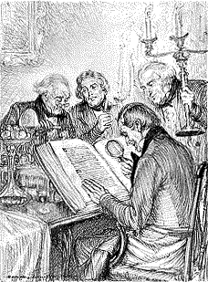
And what a marvelous book is Sartor Resartus. The 79 illustrations are uniformly excellent. Often as I'm searching through a book for an image for one of these pages, I find myself thinking, 'no, not that one' or 'this one doesn't really convey the feeling of the work.' With this book, it's impossible to go wrong. The image I chose, below, is basically a little (2.75" x 2.875") chapter heading. There are dozens with equal charm and value. And the plates are filled with images as diverse as Adam and Eve, aboriginal savages, skeletons, war, chaos and philosophers. It was published with an introduction by Sullivan which stresses how much he enjoyed illustrating the book. It shows. The entire suite of originals is in the Victoria and Albert Museum.

 In 1899 he provided illustrations (at left) for H.G. Wells stories in Pall Mall and even did
some writing for the magazine circa 1900. In an article entitled
"Roundabout Art, Illustration and Jenny"
he expresses sentiments that I think I heard last week from an
artist friend. Isn't this about what you said, Phil?
In 1899 he provided illustrations (at left) for H.G. Wells stories in Pall Mall and even did
some writing for the magazine circa 1900. In an article entitled
"Roundabout Art, Illustration and Jenny"
he expresses sentiments that I think I heard last week from an
artist friend. Isn't this about what you said, Phil?
"He laments the decline of much of the contemporary work for illustration, compared with that of the 'sixties, when illustrators were treated as artists, as respected friends and collaborators rather than factory hands or potential pickpockets. In those days, too, they had more time for their work and were more generously paid. He blames the art editors for their low standard of taste and for 'giving the public what it wants' instead of showing it what it ought to want."
I thought so.
Also in 1900, he created A Dream of Fair Women with 40 plates featuring historical and fictional females. Sartor Resartus made his reputation as one of the premier pen & ink artists of the day, so it's only fitting that he join with other masters like Herbert Railton, to produce books like Selborne (1900-1901, also with J.G. Keulemans) and The Old Court Suburb (1902, also with Claude Shepperson). He contributed plates to both books, but his numerous portraits were his most stellar efforts. 1904 saw The Citizen of the World by Oliver Goldsmith. He also illustrated fabulous tales by Herminie Templeton and others in McClure's Magazine in the U.S. circa 1906. Templeton is best known for her story, Darby O'Gill and the Good People.
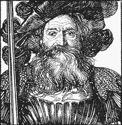
His 1908 Sintram and His Companions contains 20 illustrations for a novel based on a print by Dürer, titled 'The Knight, Death and the Devil.' Talk about setting yourself up for some stiff competition, they even reproduced the orginal Dürer etching as a frontispiece to the book. Sullivan survives the comparison. Seek out a copy. It's worth having.
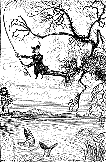
Carlyle's The French Revolution appeared in 1910 with 124 portraits in the text (his stint on The Daily Graphic paid some more dividends here) and 33 larger, more cartoonish plates. A small volume of The Comedies by Shakespeare with 14 plates, including some paintings, appeared in 1911. His work therein was not as powerful - I think because he was working for photogravure and tried more for tone than line. With rare exceptions, his pen and ink is more accomplished than his work in other media. In 1913. like so many others before and since he turned his pen to the Rubaiyat of Omar Khayyam.

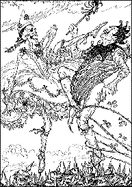
 His
76 Rubaiyat illustrations are both experimental in style
and subject, yet are often less flamboyant than his work for Sartor
Resartus or Sintram. Most of them are, for want of
a better word, Romantic - which I think is a most fitting accomplishment
on his part for this particular book. There are, of course, some
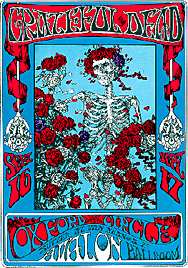
decidedly unromantic images here, too. His penchant for skeletons
is catered to here in six of the plates including the one at left
and arguably his most famous graphic, the skeleton with roses
that was incorporated into the 1966 Grateful Dead rock
poster by Alton Kelly and Stanley Mouse (at right) appears here.
His
76 Rubaiyat illustrations are both experimental in style
and subject, yet are often less flamboyant than his work for Sartor
Resartus or Sintram. Most of them are, for want of
a better word, Romantic - which I think is a most fitting accomplishment
on his part for this particular book. There are, of course, some
decidedly unromantic images here, too. His penchant for skeletons
is catered to here in six of the plates including the one at left
and arguably his most famous graphic, the skeleton with roses
that was incorporated into the 1966 Grateful Dead rock
poster by Alton Kelly and Stanley Mouse (at right) appears here.
 Another
famous skeleton piece is the one at left from his acerbic, The
Kaiser's Garland in 1915 - 44 anti-German cartoons. There's
yet another in Legal and Other Lyrics from 1916, but this
title has a strong humorous bent as well so I've chosen that aspect
of the book to show at right. (no close-up views on these, sorry.)
Another
famous skeleton piece is the one at left from his acerbic, The
Kaiser's Garland in 1915 - 44 anti-German cartoons. There's
yet another in Legal and Other Lyrics from 1916, but this
title has a strong humorous bent as well so I've chosen that aspect
of the book to show at right. (no close-up views on these, sorry.)
And since we've finally brought some color into this piece, allow me to show you that he was capable of using it himself. Below left is one of two paintings he did that appeared in the oversized Bibby's Annual for 1917. He had pen & ink work in several others from the period. At right is one of the color plates from his 1922 version of Tennyson's Maud. Despite my focus on his illustrations and his line work, he also was active as a watercolorist and etcher. I've not seen samples* of his work in these media.
|
|
 Sullivan
was one of the twenty illustrators invited to contribute to Percy
V. Bradshaw's The Art of the Illustrator in 1920. This
collection of portfolios showed how each artist worked through
a set of six plates showing the stages of a single illustration.
Sullivan, in his pluckish ways, contributed a complex composition
featuring an artist, a nude model, a cluttered studio and, what
else, a skeleton. The plates are accompanied by cogent commentary
by Bradshaw and a rambling six-page discourse by Sullivan on illustration
and illustrators. A year later he authored The Art of Illustration,
a rambling, 257-page treatise on illustration and illustrators.
And a year after that, in 1922, he wrote Line, which is
his attempt to convey the more technical aspects of his craft,
with many examples of his own devising. All three are interesting
reads.
Sullivan
was one of the twenty illustrators invited to contribute to Percy
V. Bradshaw's The Art of the Illustrator in 1920. This
collection of portfolios showed how each artist worked through
a set of six plates showing the stages of a single illustration.
Sullivan, in his pluckish ways, contributed a complex composition
featuring an artist, a nude model, a cluttered studio and, what
else, a skeleton. The plates are accompanied by cogent commentary
by Bradshaw and a rambling six-page discourse by Sullivan on illustration
and illustrators. A year later he authored The Art of Illustration,
a rambling, 257-page treatise on illustration and illustrators.
And a year after that, in 1922, he wrote Line, which is
his attempt to convey the more technical aspects of his craft,
with many examples of his own devising. All three are interesting
reads.
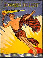
He was a noted teacher and taught classes in both Book Illustration
and Lithography. Some of his latest illustrations were done for
the famous Joseph Bibby, editor of Bibby's Annual. Towards
the Light at left was done in 1932. He died in 1933.
* ask and thou shalt receive. Here, compliments of subscriber
Nigel Hills, is a Sullivan etching. Isn't the Internet amazing?!
 To learn more about E.J. Sullivan, see:
| The Art of the Illustrator | Percy V. Bradshaw, 1920 |
|
|
James Thorpe, 1948 Art and Technics |
| The Dictionary of British Book Illustrators and Caricaturists 1800-1914 | Simon Houfe, 1978 Antique Collectors' Club |
| The Vadeboncoeur Collection of Knowledge | Jim Vadeboncoeur, Jr. 2000 |
|
Illustrations are copyright by their
respective owners. This page written, designed & © 1998 by Jim Vadeboncoeur, Jr. Updated 2011. |
