

|
Rare Parrish in issues 1, 4, 5, & 9 of two nice drawings in First and Third Annual Collections |
 |
|||
 |
||||
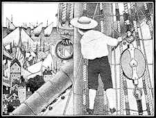
This one image in Coy Ludwig's indispensable 1973 book, Maxfield Parrish, told me a great deal about Parrish. I'll explain why it is so fascinating in a moment.
 Frederick
Parrish (he would adopt the name Maxfield later) was born in Philadelphia
in 1870 - of the generation of Orson
Lowell, C.D. Gibson, Elizabeth
Shippen Green, W.T. Benda, Franklin
Booth, Howard
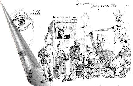
Chandler Christy and F.R. Gruger. That made him almost 14
when he decorated the letter below - so take heart all you young
doodlers. He illuminated many such letters that he wrote from
London and Paris during 1884-86. John Goodspeed Stuart has collected
many of them in his fascinating book, Young Maxfield Parrish
(1992). As much as the letters show the pure "boy" in
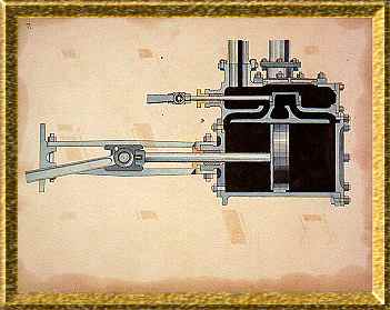
Parrish (don't you just love the monocle that looks like a weeping eyeball and "DUDE"?),
other images from the book show a precocious talent for design
and rendering. The piston at left is from the same time period,
if not slightly earlier.
Frederick
Parrish (he would adopt the name Maxfield later) was born in Philadelphia
in 1870 - of the generation of Orson
Lowell, C.D. Gibson, Elizabeth
Shippen Green, W.T. Benda, Franklin
Booth, Howard
Chandler Christy and F.R. Gruger. That made him almost 14
when he decorated the letter below - so take heart all you young
doodlers. He illuminated many such letters that he wrote from
London and Paris during 1884-86. John Goodspeed Stuart has collected
many of them in his fascinating book, Young Maxfield Parrish
(1992). As much as the letters show the pure "boy" in
Parrish (don't you just love the monocle that looks like a weeping eyeball and "DUDE"?),
other images from the book show a precocious talent for design
and rendering. The piston at left is from the same time period,
if not slightly earlier.
His artistic talents were encouraged by his parents and though it was initially architecture that beckoned him, it was quite obvious that he would be an artist. His college work was remarkably sophisticated. In 1893 he approached Howard Pyle in hopes of getting instruction, but he was told that Pyle had nothing to teach him. Parrish audited a few of Pyle's classes at the Drexel Institute and came to the same conclusion. It was time to start a long and respected career.
 He is
best known for his color (people speak of "Parrish blue"),
but his earliest work was b&w. In 1897, he illustrated Kenneth
Grahame's "The Walls Were As of Jasper"
(one image at left) for the August 1897 issue of Scribners
Magazine. He would revisit Grahame's work in two books, Dream
Days and The Golden Age in 1899 & 1900. Though
both of these and his other 19th century books, Mother Goose
in Prose and Knickerbocker's History of New York, were
b&w, they all displayed the attention to detail, composition
and texture that would make his color work so instantly recognizable.
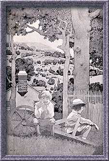
At right is one of the illustrations from The Golden Age,
taken from the 1904 photogravure edition. All of this early work
was reprinted in The Black and White Parrish from Thumb
Tack Books in 1982.
He is
best known for his color (people speak of "Parrish blue"),
but his earliest work was b&w. In 1897, he illustrated Kenneth
Grahame's "The Walls Were As of Jasper"
(one image at left) for the August 1897 issue of Scribners
Magazine. He would revisit Grahame's work in two books, Dream
Days and The Golden Age in 1899 & 1900. Though
both of these and his other 19th century books, Mother Goose
in Prose and Knickerbocker's History of New York, were
b&w, they all displayed the attention to detail, composition
and texture that would make his color work so instantly recognizable.
At right is one of the illustrations from The Golden Age,
taken from the 1904 photogravure edition. All of this early work
was reprinted in The Black and White Parrish from Thumb
Tack Books in 1982.
 Some
of Parrish's earliest color paintings can be found in the pages
of The Century magazine. At left is an image from the December
1901 issue illustrating "Milton's L'Allegro."
While quite striking, it appears rather murky and not at all like
his work only a couple of years later. There were earlier color
Parrish illustrations, but most were black & white drawings
with color oil glazes added to prints of the originals.
Some
of Parrish's earliest color paintings can be found in the pages
of The Century magazine. At left is an image from the December
1901 issue illustrating "Milton's L'Allegro."
While quite striking, it appears rather murky and not at all like
his work only a couple of years later. There were earlier color
Parrish illustrations, but most were black & white drawings
with color oil glazes added to prints of the originals.
I've mentioned before in these essays that the techniques of color reproduction were quite varied during the period around 1900-1910. It was still an art and individual printers varied widely in their skills. The invention of "process" color, wherein a painting was photographically "separated" into three colors (cyan, magenta, and yellow) plus black, paved the way for more consistent methodology. Parrish, like many other artists experimented with the best painting techniques to accommodate these new methods. (Edmund Dulac always tried to maintain a soft edge to his images to allow for errors in registration.) What Parrish (alone!) did was a result of the printers' methods and was directly responsible for the unique 'feel' and luminosity of his art.
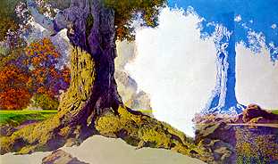
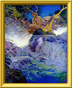
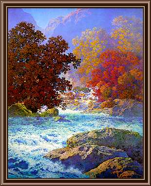
Let's
get back to that first picture. Here's another look at it. It
was a finished piece titled 'Dreaming' (or 'October')
painted in 1928. There was originally a nude young woman seated
on the large root of the left tree. After publication, Parrish
decided to change it and never completed the job. This one canvas
demonstrates his very unique and remarkable technique. What you're
looking at in the upper right quadrant is Parrish painting the
cyan printing plate - every color that contains some tint of blue!
That's blue, green, brown, purple - in all shades and tones. Parrish
mentally assessed the blue component and painted it directly onto
a base of white (paper, gesso, etc.) in a thin, transparent glaze.
When light was shined on the painting, it would penetrate the
transparent glazes, reflect off the white base and mix the final
colors in a brilliant manner impossible to achieve with mixed
pigments.
sidenote: We perceive color in objects by the spectrum of light not absorbed by the pigment. The darker the color, the less light gets reflected. The less light reaching our eyes, the murkier the color becomes. We perceive color in light in just the opposite manner. Shining a light through a color causes that portion of the spectrum to be absorbed. The purer the color, the more light is available to our eyes and the brighter the color appears. Parrish explained his technique at length in Ludwig's Maxfield Parrish. I've transcribed and annotated his explanation in a page I call Color & Light. If this aspect of his work fascinates you, please check it out.
 Enough
of this technical stuff! It's the magic of his images that I really
want to discuss. By 1900, Parrish was an established, successful
artist with membership in the Society of American Artists, a new
wife, a custom built studio on the New Hampshire/Vermont border.
His art was in magazines, books and was receiving recognition
in the exhibits and expositions when he submitted to them. Most
significantly, the public was enamored with his images. A trip
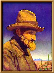
to Arizona in early 1902 resulted in a suite of seven color plates
that seem to have been crafted with the earliests versions of
the new "varnish" technique above and capture the colors
and light of the desert. Compare "Bill Sachs - The
Flying Dutchman" (Century - November 1902)
at left with the image only a year earlier from "Milton".
The brilliance is blinding and the sky is the essence of pure
"Parrish Blue." (Even more telling are the four images
by Howard Pyle that I scanned for his page. They are from the
same magazine, the following month!)
Enough
of this technical stuff! It's the magic of his images that I really
want to discuss. By 1900, Parrish was an established, successful
artist with membership in the Society of American Artists, a new
wife, a custom built studio on the New Hampshire/Vermont border.
His art was in magazines, books and was receiving recognition
in the exhibits and expositions when he submitted to them. Most
significantly, the public was enamored with his images. A trip
to Arizona in early 1902 resulted in a suite of seven color plates
that seem to have been crafted with the earliests versions of
the new "varnish" technique above and capture the colors
and light of the desert. Compare "Bill Sachs - The
Flying Dutchman" (Century - November 1902)
at left with the image only a year earlier from "Milton".
The brilliance is blinding and the sky is the essence of pure
"Parrish Blue." (Even more telling are the four images
by Howard Pyle that I scanned for his page. They are from the
same magazine, the following month!)
 Magazine
covers were a perfect showcase for his luminous paintings. Colliers
especially took major advantage of his art and those issues (from
1904 through 1913) are prized by collectors. Magazines like Scribners
and Century often featured Parrish in the lead spot with
a color frontispiece in addition to the occasional cover. "The
Errant Pan" (right) is the frontispiece from Scribners,
August 1910. Other magazines that used Parrish art included Harpers
Weekly, Hearst's, Ladies' Home Journal, Life,
McClures, and yet many more.
Magazine
covers were a perfect showcase for his luminous paintings. Colliers
especially took major advantage of his art and those issues (from
1904 through 1913) are prized by collectors. Magazines like Scribners
and Century often featured Parrish in the lead spot with
a color frontispiece in addition to the occasional cover. "The
Errant Pan" (right) is the frontispiece from Scribners,
August 1910. Other magazines that used Parrish art included Harpers
Weekly, Hearst's, Ladies' Home Journal, Life,
McClures, and yet many more.
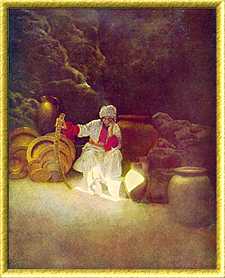 Book
illustrations were equally in demand. His post-1900 color output
included: Italian Villas and Their Gardens and Poems
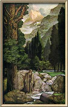
of Childhood (1904), The Arabian Nights (1909) (an
image at left), A Wonder Book and Tanglewood Tales (1910)
and The Knave of Hearts (1925).
Book
illustrations were equally in demand. His post-1900 color output
included: Italian Villas and Their Gardens and Poems
of Childhood (1904), The Arabian Nights (1909) (an
image at left), A Wonder Book and Tanglewood Tales (1910)
and The Knave of Hearts (1925).
Unless you've seen the originals, one aspect of his printed work may not be obvious. That is that there are no book reproductions that can really do them justice. The reason for this is that in photographing one of his paintings for reproduction, the camera must be at right angles, directly in front of the picture to avoid distortion. That means the light sources aimed at the picture to illuminate it are usually located on either side at 30 to 45 degree angles. While this works admirably for most images, Parrish's paintings demand a light source closer to the position of the viewer in order for the reflected light to best mix the colors for our eyes.
The web, with its pixel-based light source (behind the image) is more capable than print, but too many scans I found on the web don't seem to take advantage of this. I wish I could reproduce everything, but it just isn't possible. I'll give you links later that will let you see more. Please note that all the images above (except for the first two and the unfinished piece from the Ludwig book) were taken from their original magazine or book appearances.
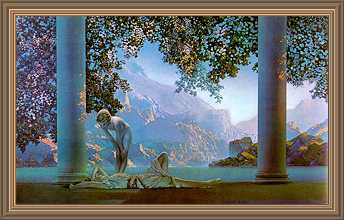
While books and magazines provided him with an enormous public following, it was his prints and calendars that gave him the widest exposure. Hundreds of thousands of images were printed and distributed. It started in 1904 with reproductions of 'Air Castles' (a Ladies' Home Journal cover) and continued through 1920 with prints from previously published sources (advertisements, covers, candy boxes, etc.). In 1920 he abandoned advertising for prints and calendars. His prints of images created for candy box lids had fueled the public interest and Parrish wanted to create paintings for reproduction unfettered by commercial considerations. The first such image was 'Daybreak.' It was his masterpiece.
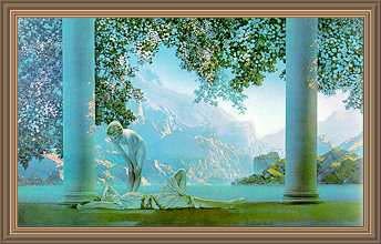
This is what 'Daybreak' looks like in Ludwig's book, Maxfield Parrish. But I was privileged to view the original about thirty years ago, and what you see above isn't really what it looks like. I was mesmerized when I saw the painting in Alma Gilbert's original gallery in San Mateo. She had it set up with a strong light on a rheostat directed from behind and slightly above the viewer. When the rheostat was turned up to shine more light, it was really and truly like day was breaking. Instead of a noun, the title was a verb! The painting is not nearly so blue as most reproductions make it seem. I think this is one drawback of the reputation of "Parrish Blue" - paintings that are not prime examples of the term are shoehorned into the mode during reproduction. 'Daybreak' is pinks and lavenders and dark greens and, with sufficient light, golden. It is only peripherally blue.
If my memory serves, in low light it looks more like the image below. Click it to see how the painting changed with additional light.
 'Daybreak'
was an immediate and staggering success. More lissome, lightly
clothed lasses in mock-classical settings followed. The public
couldn't get enough. With the exception of his justly famous Knave
of Hearts book in 1925, the remainder of Parrish's career
was mainly spent painting these popular images and a series of
sumptuous landscapes for Brown & Bigelow calendars published
from 1937 through 1962. Each calendar had one Parrish print and
Ludwig reproduces many of them - unfortunately only a couple in
color - like the one from 1950 at right. He created several murals,
some of which still adorn famous hotels and bars from coast to
coast.
'Daybreak'
was an immediate and staggering success. More lissome, lightly
clothed lasses in mock-classical settings followed. The public
couldn't get enough. With the exception of his justly famous Knave
of Hearts book in 1925, the remainder of Parrish's career
was mainly spent painting these popular images and a series of
sumptuous landscapes for Brown & Bigelow calendars published
from 1937 through 1962. Each calendar had one Parrish print and
Ludwig reproduces many of them - unfortunately only a couple in
color - like the one from 1950 at right. He created several murals,
some of which still adorn famous hotels and bars from coast to
coast.
He lived his entire life at his New Hampshire home/studio at
The Oaks with his wife, who died in 1953, and his mistress and
model, Sue Lewin, who survived his death in 1966 at age 95. He
was by all accounts a charming and intelligent man whose writings
add a great deal to the text in Ludwig's book. His flouting of
social mores seems to be of a piece with the 'exceptions' granted
the rich and talented. He certainly qualified.
 To learn more about Maxfield Parrish, see:
| Maxfield Parrish | Coy Ludwig, 1973 Watson-Guptill |
| The Illustrator in America 1880-1980 | Walt & Roger Reed, 1984 Madison Square |
| Young Maxfield Parrish | John Goodspeed Stuart, 1992 Stuart |
| The Collectible Maxfield Parrish | William Holland & Douglas Congdon-Martin, 1993 Schiffer |
| The Vadeboncoeur Collection of Knowledge | Jim Vadeboncoeur, Jr. 1999 |
| The Vadeboncoeur Collection of ImageS #s 1,4, 5 & 9, B&W 1, 3 | Jim Vadeboncoeur, Jr. 2001-2003, 2006, 2007 |
|
Illustrations are copyright by their
respective owners. This page written, designed & © 1999 by Jim Vadeboncoeur, Jr. Updated 2011. |
