

|
#s 1-3 feature Franklin Booth art See his color work in issue 4 of |
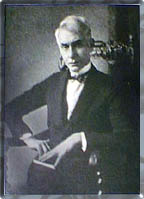
An artist for the ages, Franklin Booth, born 1874, was a product of his time. Isolated on an Indiana farm and determined to be an artist, he studied what he saw on the pages of Scribner's, Harpers and the other illustrated magazines of the day. What he saw, and what there was to see, were wood-engraved images. Photographic reproduction was in its infancy and was used primarily for halftones of paintings. After all, everyone knew how to reproduce pen & ink work: you engraved it on wood.
 Booth,
not knowing that the line and even the "feel" of the
image was a product of the engraver, copied what he saw using
pen on paper. By the turn of the century, when Booth was embarking
on his incredible career, the technology had advanced enough so
that his pen work could be reproduced as he crafted it. His style
was an amazing amalgam of antique appeal and awesome artistry.
Soaring, majestic scenes were crafted with thousands of lines,
each placed in the precise position with respect to its neighbor
to provide just the right density and shade.
Booth,
not knowing that the line and even the "feel" of the
image was a product of the engraver, copied what he saw using
pen on paper. By the turn of the century, when Booth was embarking
on his incredible career, the technology had advanced enough so
that his pen work could be reproduced as he crafted it. His style
was an amazing amalgam of antique appeal and awesome artistry.
Soaring, majestic scenes were crafted with thousands of lines,
each placed in the precise position with respect to its neighbor
to provide just the right density and shade.
His drawings are literally awash in ink lines, yet they maintain an openness that seems impossibly contradictory. Witness The New House at left, originally an illustration for a poem in Good Housekeeping and reproduced in both The Indiana Home and Franklin Booth: 60 Drawings. In the original, the newly framed house sits clearly upon the knoll seen between the trees, yet the fine lines that delineate the clouds can be seen though the open rafters. The control Booth was able to wield and the clarity he generated with his unique approach was, hell, it still is, unmistakably the work of a genius.
(We've often seen Booth's work likened to old steel engravings, but being familiar with both wood and steel engraved images, I think it is extremely unlikely that his style is descendant from the latter.)
"It is his sincerity, this belief in himself and in the integrity of his commission, that has kept his work on so high a plane. Designs by him made for advertising purposes are sought by collectors with the same eagerness as designs for less material purposes, for they have the same quality.
"Mr. Booth possesses to a rare degree the power of expressing in design or picture an idea, an abstract conception. He illustrates not so much things as thoughts.
"He is much sought after by advertisers and art directors because his peculiar and individual style is successfully practiced by no one else. His imitators are many. They copy his technique, but they lack his inspiration.
"His two great qualities are his dexterity with his pen and his imagination. His work appeals to the spirit. It has an uplifting effect. It suggests something just beyond, an ideal almost realized. His fine craftsmanship never becomes mere dexterity. It remains always, as it should be, the instrument for expressing a fine creative imagination."
Ernest Elmo Calkins (from the Appreciation to Franklin Booth: 60 Drawings)
The image of worshipers in the church above could just as easily have been an illustration for a devotional poem or an Estey Organ advertisement. To Booth's sensibilities, both were of equal merit and deserved the same effort.
 Booth's
artistry and appeal influenced artists throughout the century.
His style was slavishly imitated and copied during his career.
Roy Krenkel
unashamedly dedicated drawings to Booth and drew upon his work
for inspiration. Berni Wrightson's Frankenstein is an unabashed
paean to the man and the style. Artists and art fans alike are
still enthralled with his art today. The universal appeal of the
style is interesting. The "old-time" feeling that hearkens
back to the wood-engraved images of the 19th century really doesn't
explain why modern art students are so taken with the approach.
I think that what attracted interest then and now is the talent
and compositional skills that were conspicuously absent in his
contemporary mimics. These compositional abilities are even more
amazing when one learns that Booth crafted his images a section
at a time, painstakingly detailing a portion in ink that he had
carefully penciled. He would complete a section in ink before
applying the pencil to another part of the drawing. The innumerable
strokes of the pen were prone to cause smudging if he were to
have fully penciled the entire piece, so this piecemeal approach
was his norm. To create and maintain a consistent and regular
pattern and density of lines using this method must have been
exceedingly difficult, yet he seems to have carried it off with
aplomb..
Booth's
artistry and appeal influenced artists throughout the century.
His style was slavishly imitated and copied during his career.
Roy Krenkel
unashamedly dedicated drawings to Booth and drew upon his work
for inspiration. Berni Wrightson's Frankenstein is an unabashed
paean to the man and the style. Artists and art fans alike are
still enthralled with his art today. The universal appeal of the
style is interesting. The "old-time" feeling that hearkens
back to the wood-engraved images of the 19th century really doesn't
explain why modern art students are so taken with the approach.
I think that what attracted interest then and now is the talent
and compositional skills that were conspicuously absent in his
contemporary mimics. These compositional abilities are even more
amazing when one learns that Booth crafted his images a section
at a time, painstakingly detailing a portion in ink that he had
carefully penciled. He would complete a section in ink before
applying the pencil to another part of the drawing. The innumerable
strokes of the pen were prone to cause smudging if he were to
have fully penciled the entire piece, so this piecemeal approach
was his norm. To create and maintain a consistent and regular
pattern and density of lines using this method must have been
exceedingly difficult, yet he seems to have carried it off with
aplomb..
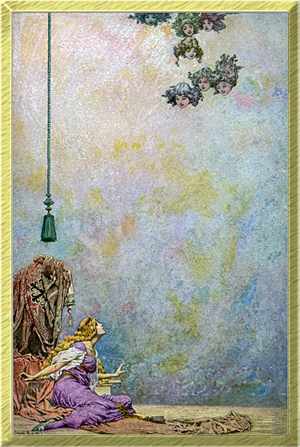
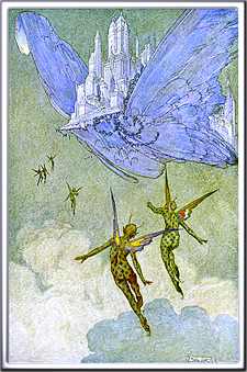 Even
his occasional color work carried the lofty, soaring feel of immense
vertical space. The perfect vehicle was The Flying Islands
of the Night, a fantasy play in verse by James Whitcomb Riley.
16 tipped-in color plates all feature spacious vistas extending
in strong vertical compositions: whether the subject matter was
high-flying fantasy (at right) or a more earth-bound figure (at
left), the canvas extended upward following the natural shape
of the book, creating a sense of majesty and power and awe. It
was the perfect approach for an assignment that could have easily
degenerated into maudlin sentimentality and perfunctory, standard
"fantastic" images. Booth's work literally makes
the book. It's unlikely that this minor romance by Riley would
be known today if not for Booth's dynamic and appealing artwork.
Even
his occasional color work carried the lofty, soaring feel of immense
vertical space. The perfect vehicle was The Flying Islands
of the Night, a fantasy play in verse by James Whitcomb Riley.
16 tipped-in color plates all feature spacious vistas extending
in strong vertical compositions: whether the subject matter was
high-flying fantasy (at right) or a more earth-bound figure (at
left), the canvas extended upward following the natural shape
of the book, creating a sense of majesty and power and awe. It
was the perfect approach for an assignment that could have easily
degenerated into maudlin sentimentality and perfunctory, standard
"fantastic" images. Booth's work literally makes
the book. It's unlikely that this minor romance by Riley would
be known today if not for Booth's dynamic and appealing artwork.
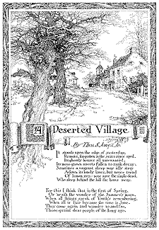 In
a career spanning the first third of the century, we find his
work as early as 1907 in Scribners illustrating the poem,
A Deserted Village (at left). All the hallmarks that were
to define his art are already present: the decorative border,
the majestic gnarled trees, the classic hand lettering and the
scroll that was to eventually frame his distinctive signature.
Commissions, both editorial and commercial followed from all of
the prominent magazines. His work can be found in Harpers,
Century, Everybody's, McClure's, Cosmopolitan, Redbook, Good Housekeeping,
House & Garden, Ladies Home Journal and more. By the early
1930's, changing fashions caused publishing and advertising
to go elsewhere for their images.
In
a career spanning the first third of the century, we find his
work as early as 1907 in Scribners illustrating the poem,
A Deserted Village (at left). All the hallmarks that were
to define his art are already present: the decorative border,
the majestic gnarled trees, the classic hand lettering and the
scroll that was to eventually frame his distinctive signature.
Commissions, both editorial and commercial followed from all of
the prominent magazines. His work can be found in Harpers,
Century, Everybody's, McClure's, Cosmopolitan, Redbook, Good Housekeeping,
House & Garden, Ladies Home Journal and more. By the early
1930's, changing fashions caused publishing and advertising
to go elsewhere for their images.
Fortunately there are those of us who keep his memory alive and an ever-renewing legion of new fans to discover and marvel at his talent.
In a puzzling aside, we must mention that the 60 Drawings
book was reprinted in 1978 by Nostalgia Press as The Art of
Franklin Booth. For some unfathomable reason that defies all
book selling logic, this modern reprint is harder to find than
the 1925 original. Since 1990, when we started keeping computer
records of books sold, we've had 23 copies of 60 Drawings
and 13 of The Art of... If anyone can explain the logic
in this, we'd love to hear it.
 To learn more about Franklin Booth, see:
| Franklin Booth - 60 Reproductions From Original Drawings | Robert Frank, 1925 Robert Frank |
| The Illustrator in America 1880 to 1980 | Walt and Roger Reed, 1984 Madison Square Press |
| The Illustrator in America 1900-1960's | Walt Reed, 1966 Reinhold |
| 200 Years of American Illustration | Henry Pitz, 1977 Random House |
| The Vadeboncoeur Collection of ImageS 4, B&W ImageS 1-3 | Jim Vadeboncoeur, Jr. 2002 2004, 2006, JVJ Publishing |
|
Illustrations copyright by their respective
owners. This page written, designed & © 1997 by Jim Vadeboncoeur, Jr. Updated 2011. |
