

Issues 2 & 5 feature Vierge artwork in color. He's the InkSpot artist in #4. |
 |
Special #5 has SIX pages from 1897 magazines. |
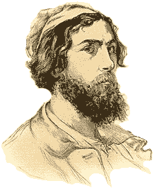
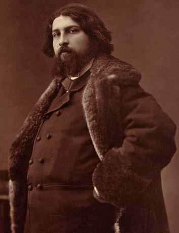 Daniel Vierge
is often referred to as "The Father of Modern Illustration"
- but just what the heck does that mean? He was born in 1851 and
surely pen, ink and paper had been around several thousand years
before that. And what was so "Modern" about him? Howard Pyle was born in
1853, E. A. Abbey in
1852, and they certainly were modern and illustrators and they,
too, used pen & ink. So who was Daniel Vierge Urrabieta and
what did he do?
Daniel Vierge
is often referred to as "The Father of Modern Illustration"
- but just what the heck does that mean? He was born in 1851 and
surely pen, ink and paper had been around several thousand years
before that. And what was so "Modern" about him? Howard Pyle was born in
1853, E. A. Abbey in
1852, and they certainly were modern and illustrators and they,
too, used pen & ink. So who was Daniel Vierge Urrabieta and
what did he do?
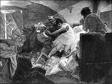
To start with, he was Spanish - born in Madrid to a noted illustrator. He studied at the Madrid Academy and by the age of 16 was working for a leading local paper, Madrid la nuit. In 1869 he moved to Paris to become a painter. This was thwarted by the Franco/Prussian War. Where most people would have quickly returned to Spain, Vierge made excellent use of this interruption to create images such as "Scene de la Guerre Franco/Allemande" below. He sought out all aspects of the conflict and made drawings. He filled multiple notebooks with sketches from life, many of which would become the basis for illustrations that would appear, starting with the Sept. 17, 1870 issue, in Le Monde Illustre, a leading Paris magazine.
 All
that is preamble to set the stage for a lesson in reproduction
techniques. Up through the 1870's, magazines and books that reproduced
line drawings (as opposed to a painting like the one above), were
engraved on wood, usually by another person. Take, for instance,
Vierge's drawing at right of Notre Dame. The vagaries of the internet
and computer monitors conspire to make it difficult to make my
point. But
if you'll click on the image, you'll see an enlargement of the
portion bounded by the square. This is what reproduced drawings
(be they originally pen & ink, pencil or crayon) looked like
in 1872. Study the image, then come back and I'll tell you why
they looked like that and what Vierge did to change it.
All
that is preamble to set the stage for a lesson in reproduction
techniques. Up through the 1870's, magazines and books that reproduced
line drawings (as opposed to a painting like the one above), were
engraved on wood, usually by another person. Take, for instance,
Vierge's drawing at right of Notre Dame. The vagaries of the internet
and computer monitors conspire to make it difficult to make my
point. But
if you'll click on the image, you'll see an enlargement of the
portion bounded by the square. This is what reproduced drawings
(be they originally pen & ink, pencil or crayon) looked like
in 1872. Study the image, then come back and I'll tell you why
they looked like that and what Vierge did to change it.
The first thing you'll notice is that there is a sameness to the width of the finest lines. No matter how dense the wood into which the image was cut, the engraver was faced with the physical constraints of the technique and the medium. After all, the amount of wood that was left on the printing surface had to be sufficient to withstand the rigors of multiple impacts of the press - one for each copy printed. An exceedingly fine line could only be created with an exceedingly fine sliver of wood that would be easily destroyed early on in the print run.
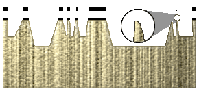 At
some point, the wood collapsed and could no longer convey ink
to the paper. Rather than a thin line, there was no line.
At
some point, the wood collapsed and could no longer convey ink
to the paper. Rather than a thin line, there was no line.
Every artist had to face these inherent restrictions. There was
no such thing as a "fine line pen & ink" drawing
in print. In fact, most of the images drawn for reproduction on
wood were done in pencil or brush - often right on the wood. It
was about this time (1875) that the first inklings (ouch!) appeared
of what was to come .
In a classic case of getting it "almost right" the first time (remind me to tell you about post-its someday), they decided that they could use photography to transfer an image to the wood block. Coat the surface of the wood with photo-emulsion and expose it to the art through a camera lens. Now it was both feasible and almost practical to create a drawing using pen & ink. If nothing else, it gave the final printed illustrations a bit more spontaneity as the old method often relied on the engraver to do the transfer to the block, making the finished product one more level removed from the artist's intentions. Vierge was destined to change all that, but let's get back to the biography.
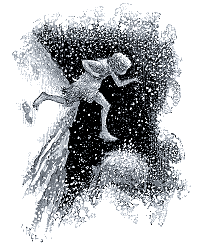 The
1870's were spent illustrating primarily for French magazines
and books. After Le Monde Illustre (The Illustrated
World) came work on La Vie Moderne (The Modern Life).
Then, among other books, he illustrated a history of France by
Michelet and a series of Victor Hugo titles - with other artists.
The only sample I have is a two-volume 1888 English reprint of
The Man Who Laughed. The original French edition was circa
1875. At left is a small sample of the more than 60 illustrations
he did for the set (there were an equal number by a G. Rochegrosse).
All were engraved on wood and, again, the computer monitor makes
it nigh impossible to provide you with a realistic sample without
massive download times. Suffice it to say that while many of the
illustrations were commonplace in their execution, the designs
of Vierge were anything but. Even the simple chapter tail at left
is striking in its use of snow to create a vignetting effect and
quite daring in its mid-leap pose - a technique with which Pyle
would dazzle the American market a decade later.
The
1870's were spent illustrating primarily for French magazines
and books. After Le Monde Illustre (The Illustrated
World) came work on La Vie Moderne (The Modern Life).
Then, among other books, he illustrated a history of France by
Michelet and a series of Victor Hugo titles - with other artists.
The only sample I have is a two-volume 1888 English reprint of
The Man Who Laughed. The original French edition was circa
1875. At left is a small sample of the more than 60 illustrations
he did for the set (there were an equal number by a G. Rochegrosse).
All were engraved on wood and, again, the computer monitor makes
it nigh impossible to provide you with a realistic sample without
massive download times. Suffice it to say that while many of the
illustrations were commonplace in their execution, the designs
of Vierge were anything but. Even the simple chapter tail at left
is striking in its use of snow to create a vignetting effect and
quite daring in its mid-leap pose - a technique with which Pyle
would dazzle the American market a decade later.
But also during this decade Vierge was revolutionizing illustration.
 Don Quixote
is Spain's greatest novel, followed, it is said, by Pablo de
Segovia, which both preceded and probably inspired Cervantes.
Wise enough not to attempt the Cervantes classic as his first
major effort, but brash enough at 25 to try Quevedo's Segovia,
Vierge began to prepare for a new kind of illustrated book.
Don Quixote
is Spain's greatest novel, followed, it is said, by Pablo de
Segovia, which both preceded and probably inspired Cervantes.
Wise enough not to attempt the Cervantes classic as his first
major effort, but brash enough at 25 to try Quevedo's Segovia,
Vierge began to prepare for a new kind of illustrated book.
By this point in his career, he was fed up with the "interpretations" of the engravers - no matter how talented and well-intentioned. Most often, these were translators of his drawings who "labored to give the word for the word" interpretation and "attached little importance to the meaning of the phrase".(1) Why, he asked, can't one use the same photographic techniques to reproduce the original drawing onto a metal printing plate instead of onto the engraver's block? With the help of a talented French photo-engraver named Gillot, he did just that. Gillot took a drawing and through photography and some hand-retouching managed to create a metal plate directly from the art. With the etched grooves in the near-impervious metal holding the ink, there were no restrictions on line weight. Vierge was suddenly unfettered.
'Suddenly' is not too dramatic a word, either. Try to imagine the options he had. He could draw twice-up and reduce the image to create lines as fine as the camera could see. He could spot blacks that weren't totally black - but weren't speckled with the cross-hatching the engraver's used to "suggest" almost black. He could draw with his pen and create patterns and textures that were previously impossible. Nothing stood between him and the final image except his own abilities. Up to this point in history, a pen drawing was a study, a sketch, an intermediate step or simply an instruction to an engraver. Vierge (and Gillot, let's not forget him) turned pen drawing into a medium and an art form. Click on the image above left to see what this process allowed him to do.
Vierge was a prolific artist and rather solitary man. It wasn't until the first edition of Pablo de Segovia was published in 1882 that the world became aware of his incredible advancement in the art of illustration. It was also when they became aware of the tragedy that had befallen him six months earlier. Towards the end of the book, the images simply stopped. Page after page of text, "a libretto without the music".(2) After completing 90 images, he had a stroke. His right side was paralyzed and he lost his speech and portions of his memory. He was 30.
 Over
a period of two years his mind returned as did movement in the
right portion of his body - with the heart-rending exception
of his right hand and wrist. Undeterred, he learned how to draw
and paint with his left. At right is a painting from 1892. While
not nearly as prolific as he had been, he completed the remaining
20 illustrations for the Pablo de Segovia (the complete
edition being published in 1892), created sixty drawings for an
edition of The Tavern of the Three Virtues, and his crowning
achievement, the 257 illustrations for his Don Quixote.
Over
a period of two years his mind returned as did movement in the
right portion of his body - with the heart-rending exception
of his right hand and wrist. Undeterred, he learned how to draw
and paint with his left. At right is a painting from 1892. While
not nearly as prolific as he had been, he completed the remaining
20 illustrations for the Pablo de Segovia (the complete
edition being published in 1892), created sixty drawings for an
edition of The Tavern of the Three Virtues, and his crowning
achievement, the 257 illustrations for his Don Quixote.
It took him ten years to create the images and the effort was foretold in the 1896 title, On the Trail of Don Quixote by August Jaccaci - a lifelong friend of Vierge. Together they retraced the journeys of the fictional Don through the Spanish countrysides. The hundred+ images set the stage for the wonders to come.
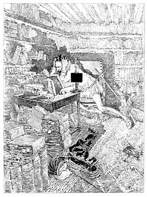 Published
as a four volume set in 1906 by Scribners, The History of the
Valorous and Witty Knight-Errant Don Quixote of the Mancha by
Miguel de Cervantes was (and remains to this day) a masterpiece.
It was printed in an edition of 1,150 copies. One of the very
first images in volume one is my favorite Vierge drawing. The
image at left of Quixote in the library surrounded by books is
stunning - especially when you realize it was created, as were
all of the images, with his left hand.
Published
as a four volume set in 1906 by Scribners, The History of the
Valorous and Witty Knight-Errant Don Quixote of the Mancha by
Miguel de Cervantes was (and remains to this day) a masterpiece.
It was printed in an edition of 1,150 copies. One of the very
first images in volume one is my favorite Vierge drawing. The
image at left of Quixote in the library surrounded by books is
stunning - especially when you realize it was created, as were
all of the images, with his left hand.
To provide a true sense of what the image looks like, I've linked a 640k version to the copy at left. Please click on it ONLY if you want to see the fine detail and are prepared to wait for the image to load. An interesting side note, I visited a local art historian who lives about two miles from me and, lo and behold, he owns the original to this piece! I've actually held it in my hands and can assure you that the reproduction in the book is truly faithful.
 To
continue with the 2" examples I've been showing you, here's
a portion of another image from Don Quixote with a link showing the amount of detail that could be contained in two inches of printed image. The continued development
of line values (note the broken, stippled sky) and the control
of width shows a marked progression over the course of the years.
To
continue with the 2" examples I've been showing you, here's
a portion of another image from Don Quixote with a link showing the amount of detail that could be contained in two inches of printed image. The continued development
of line values (note the broken, stippled sky) and the control
of width shows a marked progression over the course of the years.
After Pablo de Segovia was published in 1882, dozens of artists gravitated towards the concept of the photo-engraving process for their illustrations. Abbey was producing books using the technique prior to 1890, and dozens of others were viewing the pen in a different light - as an end rather than a means. Modern illustration had been born and Vierge was one of the parents.
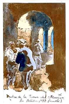
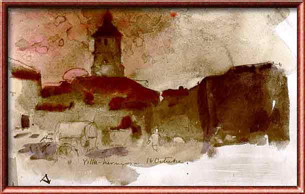
He was named a chevalier of the Legion of Honor in France in 1889, and his designs for Pablo de Segovia won the gold medal at the Paris Exhibition that same year. Below is one of his watercolors from the early 90's.
 Vierge died in 1904. He was 53.
 To learn more about Daniel Vierge, see:
| (2) "Comments on the Drawings of Daniel Urrabietta Vierge" in Pablo de Segovia | Joseph Pennell, T. Fisher Unwin 1892 |
| (1) "The Father of Modern Illustration" | August F. Jaccaci in The Century - June 1893 |
| "Daniel Vierge" an Introduction to The Tavern of the Three Virtues | Edmond Gosse, T. Fisher Unwin circa 1895 |
| Daniel Vierge - sa vie, son oeuvre | Jules de Marthold, H. Floury, 1905 |
| "Introduction" to Don Quixote | Royal Cortissoz, Charles Scribner's Sons 1906 |
| The Dictionary of British Book Illustrators and Caricaturists 1800-1914 | Simon Houfe, Antique Collectors' Club 1978, 1981 |
| The Vadeboncoeur Collection of Knowledge | Jim Vadeboncoeur, Jr. 1999 |
| The Vadeboncoeur Collection of ImageS 2, 4, 7, B&W 5 | Jim Vadeboncoeur, Jr. JVJ Publishing 2001-2003, 2010 |
I've had a few inquiries lately about "The Vadeboncoeur
Collection of Knowledge" - what is it, can it be purchased,
etc.? The simple answer is that it is truly a collection, one
that I've amassed over a period of 40-some years and which fills
many rooms in my home. I suppose it could be acquired by someone
else, just as I'm certain that other, far better collections
exist. But mine is available to me when I write these essays.
For instance, every reference listed for this (and every other)
page is in the "Collection" and was accessible to give
me data to flesh out the Vierge biography. Given that there is
no actual index to the data, I rely heavily on my experience
and memory to locate the various pieces that I use. This, too,
is part of the collection. The very unique aspect of it all is
that I make it available to any parties interested in conducting
research on artists. It's unique because they have access to
the experience and the memory parts, too. I hope that answers all of your questions.
 |
|
Illustrations are copyright by their
respective owners. This page written, designed & © 1999 by Jim Vadeboncoeur, Jr. Updated 2011. |
