


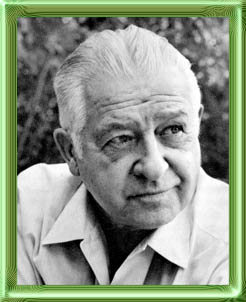
 John
Vassos was an original. It's hard to say that about too many artists
as one can usually trace a stylistic path back to an earlier influence.
I'm not sure he had one. The only source I can imagine is the
technique of display cards that were ubiquitous during his youth
and to which he applied his skills soon after he reached New York.
Born in Greece in 1898, he spent his youth in Constantinople where he was artistically active from an early age. He was the editorial cartoonist for a liberal newspaper in his early teens and when one of these cartoons featured a less-than-flattering view of the Turkish senate (he was Greek after all), he was forced to flee (supposedly for his life) on a British ship. He was 16.
 World
War I had just begun. Vassos saw action in the North Sea, at Gallipoli
and on a mine sweeper. He ended up in America in 1919 in Boston.
He soon was lettering placards and price tags and going to Fenway
Art School at night. One of his instructors was John Singer
Sargent. He spent some time as an assistant to Joseph Urban, the
man who designed the famous Ziegfeld Follies. Vassos assisted
on stage designs for the Boston Opera Company and designed promotional
material for Columbia Records in the early Twenties.
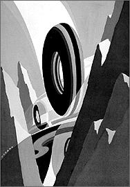
He moved to New York in 1924 and opened his own studio, accepting any and all assignments. In his free time he attended the Art Students League and studied under George Bridgman, John Sloan and others. His modern and unique style was put to use on window displays for Macy's and murals for two large movie palaces. This led to advertising work for New York firms like Cammeyer shoes and Bonwit Teller specialties. A preliminary study for a 1924 General Tires ad is at right. A restrained palette and a strong sense of design made his work stand out from the other commercial artists who were trying to synthesize a new, modern style to replace the staid Victorian approach of the previous 25 years. This was, after all, the nineteen twenties!
 It
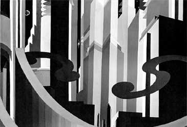
was in designs for the theatre that Vassos' style was finalized.
The typical overly-ornate, rococo elements of the turn-of-the-century
stage and theatre were overlaid with the modern, Art Deco sensibilities
of the Twenties. (Art Deco is an abbreviation of Exposition
Internationale des Arts Decoratifs
et Industriels Modernes, the 1925 French exposition in
Paris that celebrated the new, bold, streamlined style in art
and appliances.) The shape was important! Whether it was the tall,
rectilinear silhouette of a skyscraper or the simple arc from
an artist's French curve, the details were muted and the outline
carried the pertinent information to the viewer. An unused Vassos
design for a theatre curtain (above right) for a 1926 Billy Rose
musical is a perfect example. Vassos took the b&w opaque watercolors
that he'd used for price placards a few years earlier and developed
his startling and powerful approach that was unlike anything being
done. It was an immediate (to use another modern word) hit.
More advertising work followed - this time for national firms like Packard Automobiles and French Line cruise ships. The next step for this most "modern" of artists was simple - Industrial Design. After all, the concept of Art Deco was an offshoot of the William Morris notion of a marriage of art with industry. If wallpaper and drapes and windows could be art, why not cars and radios? And, since these were the most modern of times, why not juke boxes and fountain pens? He designed a face-lotion bottle that had one of the very first screwtop caps, just in time for Prohibition. Sales jumped. As the nation grew more crowded, he designed the ubiquitous turnstile to keep some semblance of order in our public lives.
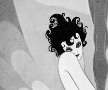
In 1926, he was asked to create a cover illustration for a stage production of Oscar Wilde's Salome. It was seen by an editor at the publishing house of E.P. Dutton and he commissioned a book from Vassos utilizing his distinct style. Salome was published in 1927 using a special printing technique called the Knudson Process. [I won't go into detail about it as there is an excellent contemporary article from a 1928 Penrose Annual available from Peter D. Verheyen on his Vassos site.] The difference between modern reproductive capabilities and this earlier patented technique are demonstrated below in a portion of an image (top) from the first limited edition of Salome and the same portion below it from the 1976 Dover book, Contempo, Phobia and other Graphic Interpretations. This latter book (from which most of the images and information in this page are taken) reproduced Vassos' original paintings using photo-offset printing. You decide which is the most apropos.
| a. The Knudson Process. This was a dot-pattern process and the moire pattern is inherent in my attempt to rescreen it for this web page. Original image was printed on coated paper, but still lacked the evenness of tone that Vassos was evidently after. |
|
| b. Photo Offset This is also a dot-pattern technique that results in a moire pattern, but either the halt-tone screens or the camera lens had improved to where the tones are more consistent. Vassos himself was involved in the production of the 1976 book and was much happier with the modern reproduction. |

|
 From 1927 to 1935, Vassos illustrated nine
books. After Salome, the next two were also adaptations
of Oscar Wilde writings: The Ballad of Reading Gaol (1928)
and The Harlot's House and Other Poems (1929). With these
he mined the same counterpoint to the economic euphoria of the
20's that Lynd Ward was to explore with his novels in woodcuts
just two years later. Wilde's despondency and eroticism were perfectly
portrayed with Vassos's restricted (I won't say "limited")
palette of tones and shapes. The style and sensibilities of the
material were very popular. All three of the books were released
as limited editions at a time when this was less and less common.
The size of these editions is indicative of the reduced market:
500/200/200. Both Salome and Ballad went through
numerous trade editions and in 1930 Salome was reissued
in a uniform binding with the others and with four additional
plates.
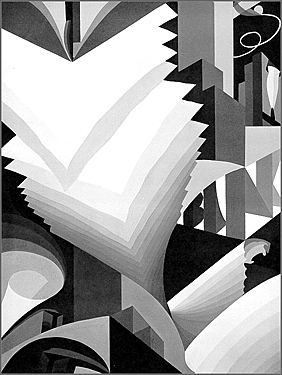
His wife Ruth provided the text for his second 1929 book, Contempo; This American Tempo. Published just before the Great Depression, the Vassos's created a ringing indictment of the economic indifference to consequences that led to it. The image above left is titled: "Advertising. An edifice reaching to the skies and built on -- BUNK." Another excoriates: "Commercialism. Chop down the forests. Harness men to desks." Eight plates from the 23 in this classic of conscience are reproduced in Contempo, Phobia and other Graphic Interpretations. Also released as a limited edition, the limitation had been reduced to 166. The era of opulent book production was facing economic realities of its own.
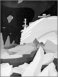 1930
saw publication of Ultimo; An Imaginative Narration of Life
Under the Earth. The limited edition was now only 115 copies.
21 images illustrate Ruth's predictive text about an ice-age brought
on by technological exploitation. John's illustrations were chilling
masterpieces of techno-impotence as massive Art Deco ocean liners
were made useless by larger masses of frozen water and humanity
drilled deep into the earth for the last remnants of heat. Twelve
of the plates are in CP&OGI.
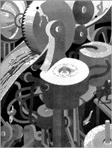 Next came
his most ambitious and his most personal work, Phobia.
It's written by him and explored 24 of the numerous and varied
fears that plague humankind. Published in 1931 by Covici, Friede,
it was hailed a masterpiece of insight by doctors and laity alike.
All but one of the images appear in Dover's Contempo, Phobia
and other Graphic Interpretations, so I thought I'd present
a largish version of the missing Mechanophobia direct
from the limited edition. Click on the small version at left to
see a large (129k) image. Much seems to have changed since Ultimo,
because the number of signed copies on Phobia was increased
to 1500.
Gray's Elegy was also released in 1931: a return to symbolism of a more universal kind. Death and its attributes couldn't contain his penchant for soaring city-structures and sinuous curves denoting clouds, though he did find a resonance with their shapes in tombstones and spirits. Eighteen plates and no limited edition. Nine plates appear in CP&OGI.
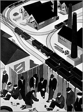 Another
classic, Coleridge's Kubla Khan, received the Vassos touch
in 1933. Thirteen plates, no deluxe edition and most likely no
reprints. Eight of the plates are reprinted in CP&OGI.
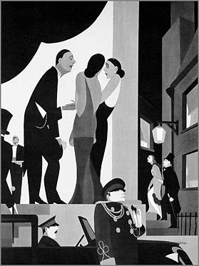
His final epic was Humanities in 1935. Ruth again provided
the text for a scathing review of the world's progress or lack
thereof in its treatment of its citizens. Two of the 24 plates
do not appear in CP&OGI.: The Elite (left)
and Waste (right). The blip of extravagance evidenced
by the large limited edition of Phobia is accentuated here
by the fact that the entire edition of Humanities
was only 2000 copies! Its bleak and honest condemnation of social
evils was not well received.
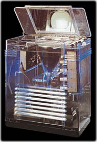 As the
market for extravagant books faded with the unrest that was to
culminate in World War II, Vassos devoted himself to industrial
design for RCA. Television was coming into commercial viability
and some of RCA's earliest sets featured cabinets designed by
Vassos. One of these was realized in transparent Lucite plastic
at the 1939 World's Fair to show that the images were indeed transmitted
through the air and not projected somehow from within.
Other Vassos designs at the fair were found in the "Radio Living Room of Tomorrow" which featured combination appliances that sound very familiar (in function) today: radio/television/record player/record-recorder in one cabinet really was the direction the future would eventually take.
He worked for RCA for over 40 years. In 1976 he oversaw the publication of the Dover title that brought his art to several new generation. He died in 1985.
 To learn more about John Vassos visit MZTV's
site on early TV,
To learn more about John Vassos visit MZTV's
site on early TV,Peter D. Verheyen's Vassos (which sadly seems to be missing as of 2011) site, or see:
| Contempo, Phobia and other Graphic Interpretations | P.K. Thomajan, 1976 Dover |
| The Vadeboncoeur Collection of Knowledge | Jim Vadeboncoeur, Jr. 1998 |
|
Illustrations are copyright by their
respective owners. This page written, designed & © 1999 by Jim Vadeboncoeur, Jr. Updated 2011. |
