


|
|

|
|
There is a color Keller piece in issues 4 & 5 of |
Arthur Ignatius Keller was born in 1866 (or '67 - both dates appear in the reference material) to a generation between Howard Pyle and his pupils. His father was an engraver and encouraged Keller to be an artist. He was born in New York City and studied art at the National Academy of Design there when he was 17. At the age of 20, he appeared in a few issues of St. Nicholas magazine - a monthly magazine for children published by The Century Co. It seems that illustration was not his first love and those few drawings marked the beginning and the end of an early career. He wanted to paint.
 Europe
was still the place for an artist to study and in 1890 he went
to Germany and the Munich Academy of Art. The Romantics
were still in full force at the end of the 19th century and the
Biedermeier style was the predominant German version of classical
academia. For almost two years Keller studied with the artist
and teacher, Ludwig von Loefftz. The academic style would remain
with him his entire career, as would the very solid foundation
of drawing skills that were stressed in almost every European
art education.
Europe
was still the place for an artist to study and in 1890 he went
to Germany and the Munich Academy of Art. The Romantics
were still in full force at the end of the 19th century and the
Biedermeier style was the predominant German version of classical
academia. For almost two years Keller studied with the artist
and teacher, Ludwig von Loefftz. The academic style would remain
with him his entire career, as would the very solid foundation
of drawing skills that were stressed in almost every European
art education.
 When
he returned to New York in 1891, he was prepared for a career
as a painter, but it didn't last. His work appears in the original
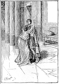
Life in 1894 and 1895, and in February of 1897, the image
at right appeared in Harpers Monthly, signaling a complete
conversion to illustration. The same year his art (the image at
left) appeared in a book, Let Us Follow Him by Sienkiewicz,
who had just made a major impact with his Quo Vadis.
When
he returned to New York in 1891, he was prepared for a career
as a painter, but it didn't last. His work appears in the original
Life in 1894 and 1895, and in February of 1897, the image
at right appeared in Harpers Monthly, signaling a complete
conversion to illustration. The same year his art (the image at
left) appeared in a book, Let Us Follow Him by Sienkiewicz,
who had just made a major impact with his Quo Vadis.
Appearing in the same issue of Harpers were Howard Pyle, A.B. Frost, Frederic Remington,
George du Maurier, Peter Newell and others. The year before, Pyle
had started teaching illustration classes at the Drexel
Institute. Within five years the illustration field would
be crowded with his students. During these five years, Keller
made his own mark. He appeared regularly in every major magazine
of the day: The Century, Harpers, Scribners,
Colliers, McClures and sporadically in many others.
And by the end of those five years, in 1903, he was president
of the Society of Illustrators, which had just been formed in
1901.
 Keller
is often classified as "another society artist" and,
while he was very capable of documenting the same material as
Christy
and Fisher and dozens of other lesser talents, he was much more
than that. While they filled the little gift books of the day
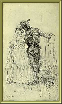
with drawing room damsels and well-dressed swains, Keller was
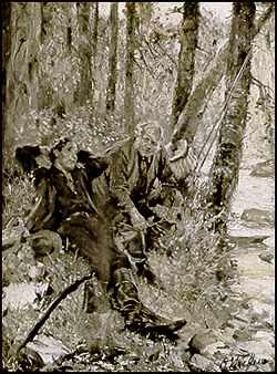
equally at home depicting the outdoors type as in the drawing
at left from Bret Harte's Her Letter. Most of the "society
artists" focused on the figures and fashions with little
effort being applied to surroundings and backgrounds. Keller could
do figures with the best of them, but his characters were firmly
situated in perfectly rendered rooms that were often as visually
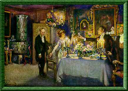
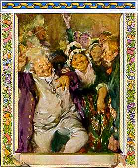
interesting as the people. See the image from George Barr McCutcheon's
A Fool and His Money (1913) below for a prime example.
Keller
is often classified as "another society artist" and,
while he was very capable of documenting the same material as
Christy
and Fisher and dozens of other lesser talents, he was much more
than that. While they filled the little gift books of the day
with drawing room damsels and well-dressed swains, Keller was
equally at home depicting the outdoors type as in the drawing
at left from Bret Harte's Her Letter. Most of the "society
artists" focused on the figures and fashions with little
effort being applied to surroundings and backgrounds. Keller could
do figures with the best of them, but his characters were firmly
situated in perfectly rendered rooms that were often as visually
interesting as the people. See the image from George Barr McCutcheon's
A Fool and His Money (1913) below for a prime example.
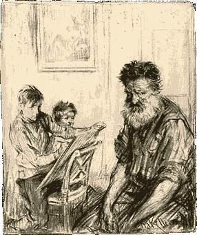 While
he continued to paint and draw for magazines throughout the decade,
he turned more and more to book illustration. His sumptuous style
and his strong drawing skills made his work always in demand.
He was equally at ease in color or wash, oils or pencil. The range
of his images always amazes me. At right is the plate he contributed
to the 1911 Society of Illustrators Annual. It's indicative
of the extensive pencil studies he did for every illustration.
Below are a few images from books from the 1905-1915 era.
While
he continued to paint and draw for magazines throughout the decade,
he turned more and more to book illustration. His sumptuous style
and his strong drawing skills made his work always in demand.
He was equally at ease in color or wash, oils or pencil. The range
of his images always amazes me. At right is the plate he contributed
to the 1911 Society of Illustrators Annual. It's indicative
of the extensive pencil studies he did for every illustration.
Below are a few images from books from the 1905-1915 era.
|
|
|
|
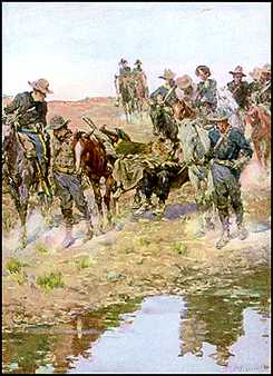
Bob Hampton of Placer by Randall Parrish (1906) |
The Calling of Dan Matthews by Harold Bell Wright (1909) |
A Christmas Carol by Charles Dickens (1914) |
He illustrated for almost all of the popular authors of his day: George Barr McCutcheon, Robert W. Chambers, Owen Wister (he did the illustrations for The Virginian), William Allen White, Meredith Nicholson, Gilbert Parker, Emerson Hough, Irving Bacheller, Joseph Vance, Mary Johnston, and dozens more. His images literally sparkled with light and his attention to detail and faithfulness to the manuscripts was appreciated by both readers and writers.
 My
favorite Keller images are not book or magazine illustrations
but the studies that he made for them. In 1920 Keller assembled
hundreds of his preliminary drawings and sketches and photographed
them. From the glass negatives that resulted, he prepared two
portfolios of photographic prints. These were published as A
Series of American Monographs * Arthur I. Keller - Figure Studies
From Life. The prints were about 11"x13" and volume
one had forty plates similar to the one at left. I've loaded a
full-size version of this plate so you can see his work and technique
up close. These plates merit close and repeated examination. For another
example, see ImageS #5.
My
favorite Keller images are not book or magazine illustrations
but the studies that he made for them. In 1920 Keller assembled
hundreds of his preliminary drawings and sketches and photographed
them. From the glass negatives that resulted, he prepared two
portfolios of photographic prints. These were published as A
Series of American Monographs * Arthur I. Keller - Figure Studies
From Life. The prints were about 11"x13" and volume
one had forty plates similar to the one at left. I've loaded a
full-size version of this plate so you can see his work and technique
up close. These plates merit close and repeated examination. For another
example, see ImageS #5.
Keller died in 1924 and the Society of Illustrators hosted a memorial exhibition in 1925. Many of his drawings were donated to the Library of Congress and might still be there today. He was elected to the SI Hall of Fame in 1989.
 To learn more about Arthur I. Keller, see:
| 200 Years of American Illustration | Henry C. Pitz, Random House 1977 |
| The Illustrator in America 1880-1980 | Walt and Roger Reed, 1984 Madison Square Press |
| American Illustration 1890-1925 | Judy Larson, 1986 Glenbow Museum |
| Famous American Illustrators | Arpi Ermoyan, 1997 Society of Illustrators |
| The Vadeboncoeur Collection of Knowledge | Jim Vadeboncoeur, Jr. 1998 |
| The Vadeboncoeur Collection of ImageS 4, 5 | Jim Vadeboncoeur, Jr. 2002, 2003 JVJ Publishing |
|
Illustrations are copyright by their
respective owners. This page written, designed & © 1998 by Jim Vadeboncoeur, Jr. Updated 2011. |
